Friday, 30 September 2011

Feedback

Excellent response is detailed and through and you have been creative with your blogs, I particularly like the use of
image and text.
There is incomplete work on your artist and record label and the target audience.Good research into CD covers and you have a wide range of examples, and this would be developed further if you can link the real product to how it will influence your own designs.  Will extend deadline as you was away for two days - can you catch up please?


Thursday, 29 September 2011

CD Cover Design for Lanmou

Digipak Covers

In terms of music the Kings of Leon are quite similar to the band we are marketing. I really like this CD cover due to its stylized look and simplicity. Even though it is just a picture of an object in front of a black wall it is very dynamic. This is due to the fact that you see a frozen image of a light bulb exploding which gives you the feeling of being stood still in time in a way. the simplistic writing and minimal use of colours give it some more of that stylized feeling to it, which represents the style which the band is going for. 


This is another band which has a similar style as the band we are promoting. This one is also quite a stylized cd cover in terms of the use of different colours. Same as the 'Kings of Leon' cover this also does not show the band itself but just portrays their style. Unlike normal pop artists they aren't really selling themselves as stars but they are selling their music to their target audience. Here the very big and colourful writing once again matches the style of the rest of the cover. So overall this cover is a lot brighter and more bubbly than the 'Kings of Leon' one.


Although Katy Perry is very different to our band in terms of the style of music she does I thought she would be a good example to use. Her audience is very mainstream, same as ours but she is selling herself as a star persona through a sexualised image. In terms of the design of the cd cover it is very girly, reflecting the themes of the music she makes but also showing the sexualised side she is trying to show. This cover focuses on her name as this is splashed across the front in a very bright pink.  


This is another one who isn't very much like our band in terms of her style of music but she has a slightly more individual feel to herself than Katy Perry. Her music is also quite mainstream but it is not as formulaic as Katy Perry, and she is marketing her voice a little more. Her cd cover is still quite sexualized but also quite simple. There is flowery wallpaper in the background, her face and the name of her band and album. Here the cover focuses on her name rather than highlighting the rest of the band as much as her, which shows how as the audience we only know her but we don't know the rest of her band.  


'Empire of the Sun' is very similar to our band in terms of the music they make and in the way they will be marketed. The cd cover is very much focused on oriental animals and buildings, with them stood in the middle dressed in military jackets made colourful and unique. The whole album cover is very colourful linking to the sky and the night, hightlighting the band members. The title is highlighted too but the first thing you look at are the musicians as they are very close to the hotspots. They then lead you down to their name and their album title. 


This is another 'Kings of Leon' cover, this time less simplistic in their style. The image reminds one of a psychology diagram and once you look closer you can see actual shapes emerging from the originally red and black outline. Once again they do not focus on the title very much, but actually they focus on the picture on the front. If you see the picture and you want to know what band it is you actually need to look closer which might be a way to mentally link that image to the 'Kings of Leon'. 


Thursday, 22 September 2011

The Pitch

Link to our Pitch:

https://docs.google.com/present/edit?id=0AcuvPz7iPH4JZGZwM3EzanRfMzI2N2hoeHNjcg&hl=en_US

Friday, 16 September 2011

Research Into Real Artists of a Similar Type

After deciding upon the track which we wanted to use, we started researching artists of a similar type and style. One band I came across which sort of reminded me of MGMT was 'Kings of Leon' just because of their style and the kind of music which they make. 


https://www.kingsofleon.com/home

kings-of-leon.jpg 

In terms of style they are also quite organic and I don't think that they have been manufactured as a band which makes them similar to MGMT. Since both of them are bands with creative concepts rather than synthetic ones, and both have a slightly ndividual style there is a base for similarities there.  


Another band which has certain similarities with MGMT is 'Radiohead'. They also have a very individual style, developing it more and more as their career progresses. The later videos are at times very weird and yet accepted by their solid fan base since they have established that image for themselves and are going more and more into that direction. In terms of music their style of music is sort of similar to MGMT as well just because of the alternative style and because of the texts. Radiohead also quite clearly have a creative concept as they do not represent the taste of a mainstream audience.


www.radiohead.com/


radio+head.JPG.jpg


Electric Feel Lyrics

Lyrical Music Concept

In our Lesson we printed out the lyrics of 'Electric Feel', in order to be able to annotate it manually and develop our concept. So this is basically a very very basic form of a written story board, since we planned out at which parts during the songs which part of the narrative is going to happen, not really taking into account all of the musical solos. 

Treatment for 'Electric Feel'

The track which we are planning to shoot our video for is ‘Electric Feel’, originally written by ‘MGMT’. The band we are promoting with this is called ‘Lanmou’ which is a band of five boys with one singer, one bass, one guitarist, one drummer and one synth.


The narrative of our video will be quite basic, and it will be inter cut by the performance aspect in a ratio of about 50:50. We decided to have such a strong representation of the performance aspect since it is the band’s first video and they need to be represented well. The video starts off with the five band member walking onto the party, dressed in a slightly alternative style of clothing and just looking around. All of a sudden they all spot a girl who fascinates them as she seems to have the ‘electric feel’. Since they don’t seem to be able to capture her attention, they leave the party and change into suits, hoping to be able to impress her that way. So they arrive at the party once again, which will be shot as an intertextual reference to reservoir dogs, and try to impress the girl again. She then finally takes pity on them and touches all of them by touching them she gives them the ‘electric feel’ and all of a sudden their clothes change into some sort of ‘indie’ style clothing and they finally get the girls attention.


This would be set on a house party which would either be staged in the studio or staged in someone’s house. The performance aspect would then be filmed in the studio, where the band is set up on stage performing their song, with lots of lights flashing from behind them, in time to the music.


What we are hoping to show with this video is mainly the band’s style and genre. Since this is the first time ‘Lanmou’ are being promoted, the image needs to be shown carefully as they will always be known for that style. So we will have the band perform in their ‘indie’ style outfits the whole way through the video, telling the story of how they got from their alternative selves to what they are now, by using the ‘Electric Feel’.


Overall I think the treatment for ‘Electric Feel’ is going to set up and establish the band’s image quite strongly. This is their first video so it will be important that a large part of the video is also focusing on the band, perhaps mainly on the singer. I also think that the narrative needs to be shown clearly to bring across the point of the video, which is focusing on the girl. The girl will also be dressed in a slightly ‘indie’ style and will be looking as good as possible for this, to fit into the band’s image which is being set up. I think that we need to focus on up keeping the same image and style throughout the video in order for it to look good.


Feedback

Excellent start to the A2 production.  your ideas are well presented and logical.  There is a real command and understanding of what you are doing.  An excellent blog, even better if you start blogging with different tools.  Try to sort the links to video's that are displayed.  Also try to link as many acadnmic idea's to your own as possible.

Thursday, 15 September 2011

Image and Audience


Link to Star Image Moodboard:

https://docs.google.com/present/edit?id=0AcuvPz7iPH4JZGZwM3EzanRfMTY4eHJidzVoZA&hl=en_US

The target audience for 'Lanmou' would probably include quite a wide range of different people, but yet it would not be mainstream. Their audience would be made up of people who listen to alternative or rock music, people who like or have an 'indie' style, young adults who are sexually attracted to the group and probably other musicians in that genre. So although their range of target audience is very broad, they would probably have a decent solid fan base but they would not be put on the charts or offered a manufacturing contract with a big label.

What type of Act is It?

The act which we want to do with our band represents them in an 'indie' style and it shows a development of their style throughout the video.

We would start the video off by having the band dressed 'alternatively', then they spot 'the girl' and they all try to change for her. So the next try at convincing her to like them is to dress in suits and walk past her, down the street, which would be an intertextual reference to 'Reservoir Dogs'. Once she sees them she decides to take pity on them and due to the song 'Electric Feel' she touches them and gives them the 'Electric Feel'. Once they have been touched they then instantly change into 'indie' style clothes, which then gives them all a happy ending as they are finally getting the attention from the girl which they wanted. This is the narrative of our video, which would be intercut with the band (the same guys already dressed 'indie') pretty much telling the story of how they got from their 'alternative' style to what they are now.

I think acts which they might be similar to are, as I have already mentioned 'Kings of Leon' and 'Radiohead', just because they would not go down the manufactured route at all, but stick to the creative concepts of their band.    

I think in terms of marketing, that although they aren't being manufactured that I would set on their looks in terms of marketing, combined with their talent. If the music videos are interesting and in a way abstract enough and the band is still good looking, playing the music which they have been playing so far I think they would attract quite a large range of audience. They wouldn't ever be considered as mainstream but still they would probably be able to create quite a solid fanbase if they use these things to sell themselves.     

Our Track

The track we decided to choose is 'Electric Feel' by MGMT. We then renamed it to 'Lanmou' to market a new band, still using the original MGMT track.

The concept of the Band is definitely creative, as it just doesn't represent a mainstream taste of music. This is why it would not be manufactured by a big conglomerate, as they would not make enough money with them. 

Electric Feel Powerpoint Link:

https://docs.google.com/present/edit?id=0AcuvPz7iPH4JZGZwM3EzanRfMTJkc3hzbTZmMg&hl=en_US

Band Name

After choosing the song and deciding upon the style for the band, we started to look into names for the band. Since our idea for the band is to represent them quite 'indie' we tried to come up with a representative band name. What we then decided to do was to look into a translation programme and started typing in phrases like 'Peace and Love' and 'Moon'. Words which we came up with, which we liked the sound of were:

- Lanmou (which is Haitan for 'Love')
- Bulan (which is indonesian for 'Moon')
- Manen (which is Danish for 'Moon')

In the end we decided to go for 'Lanmou' because it had the nicest 'indie' sound to it and we felt that it would be quite easy to remember.

Wednesday, 14 September 2011

Star Image and Development

As one of our preps we looked at Star Image and Development. The task was to pick a particular 'Star' and look at their development over time. The star at which I looked was Christina Aguileira. I do not want to make my music video in her style but I thought that she would be a good one to look at for these purposes.


In 1999 when she recorded 'What A Girl Wants' she was still more of a youthful girl, appealing to teenagers rather than adults. In terms of her star image she was quite similar to Britney Spears at the time, who was also attractive to older men in her childishness, and otherwise just to people her own age. She constructed quite a sexualized image in a youthful way which changed a lot as she grew older.
When she recorded 'Beautiful' in 2002 she still seemed very young and youthful, but not quite as childlike anymore. Her image was still sexualized but in a more mature way now and she now seems more female, adressing a slightly older audience, attracting people her own age and slightly older people. She is now also focusing the listener a bit more on her talent rather than just her looks combined with the ability to hold the tones.
In 2006 when she brought out her album 'Back to Basics' she established herself as a grown and mature woman, mainly focusing on her ability to sing. Although she did playful and sexualized songs like 'Candyman' she also did mature songs like 'Hurt' which still showed her as a sexual figure but in a grown up way. Now she is attracting people her own age and possibly even ones a bit younger than her as she definitely can't be seen as a child anymore.
In 2010 when she brought out 'Bionic' she had established herself as a fully grown woman. Style wise she was now going more along the lines of Lady Gaga and Gwen Stefani. Her image is still very sexualized but now she is also attracting a mature audience of people valuing her talent rather than just her looks. Her image is very manufactured by now to fit the expectations of a mainstream audience but this is done in a very stylized and almost odd way.
So overall Christina Aguileira had a very strong development in her star image since she had started to work in the business, moving from a teenager to a mature and grown up woman.

Initial Ideas

When I started thinking about what sort of thing I wanted to do for my music video, I thought I that I wanted to steer away from the typical music video with a basic narrative and performance aspect. Instead I wanted to do something which was a little bit more abstract and edgy, making the whole video quite dark in a way and stylizing very strongly. To fit the video I would have chosen electric music without a lot of words and focused on the narrative. I really liked the idea of making something along the lines of 'Black Swan'. I would have used the electric music and I would have used dancers a lot, possibly ballet dancers to get in that theme of 'Black Swan'. So to stylize the video I would have used edgy lighting, from behind possibly and in terms of costume for the dancers, I would have used quite classical costumes which were a little less conventional, so probably black and beige costumes. Dependant on the song which I would have used, the band or singer would be dressed quite simple I think, performing the song but focusing on the face rather than their overall performance.

A song which I looked into as a possibility of using for the music video were:

Morta by DJ Muggs


I think that 'Morta' would have worked very well stylewise although it might be a bit slow, and therefore difficult to make a whole music video for it. 

My ideas didn't really work with the ideas of the rest of the group members so my group has now had some other initial ideas which are a very different style but which I still quite like.

So initial group ideas were more alternative than my initial idea. One idea we had was to include an intertextual reference from reservoir dogs and have our main 'actors' dressed in suits throughout the video.


To go with that image, since we weren't going to use the actual reservoir dog soundtrack, we were thinking about using 'Electric Feel' by MGMT which I like very much in terms of style.


One of the problems which we have at the moment is the plot of our narrative. We can have a performance aspect which takes up quite a bit of the video, but we will need a narrative as well which is interesting enough to keep the viewer watching for 3 minutes without getting bored. Since I have a very male orientated group I don't think we will do anything with a slightly more female perspective so we will have to work a nice concept out which actually works with the song which we are going to pick.

Introduction to Advanced Portfolio

For our A2 Advanced Portfolio we have to make one music video and complete two of the following three options:
- a website homepage for the band/artist
- a cover for its release
- a magazine advertisement

All of the materials used have to be produced by the candidates themselves, except for the sound track of the songs we choose to shoot our videos for. We also need to get the permission from the artists to be allowed to use their songs for our music videos.   

There are three categories for which the marks will be allocated:
- Research and Planning
- Construction
- Evaluation

The markers are supposed to choose the level of marks according to 'best fit'. Candidates should also not rely on other group members in terms of work and the grades they will receive for it as every person will be marked individually. So one member of the group could receive very different marks overall than the other members of the group, according to their amount of work leading up the finished product.  

Monday, 12 September 2011

What Are Music Videos?

'Music Video is not primarily a commodity form but a promotional one' 
(Andrew Goodwin, 1992)
This means that the music videos aren't directly produced to make money, but that they are produced to promote the music and therefore make money through that promotion. 


'They now provide pictures for the songs in our heads. Goodbye imagination. ... All kids have to do is watch and listen, stare straight ahead. No need to think, to embellish, to create, to imagine. The electric fix is in.' 
(Joe Saltzman, USA today)
Here Joe Saltzman is saying that the music videos are destroying our imagination in a way because the pictures are put to the videos for us and there is no need to imagine anything anymore. 


Music Videos are ways of marketing for other Media products- for example Eminem in '8 Miles'. So in other words, music videos are just essential synergetic tools within any form of media and therefore cross convergence.

splash_01.jpg


Music Videos are the only reason that Music Channels exist. Music channels are just another way of promoting these 'products' so you could say that they are just constant advertising channels. The reason that people watch music channels so much is that music videos tend to have a much higher entertainment factor than normal adverts, since we listen to the music itself at other times, where we wouldn't listen to the pure soundtracks of normal adverts. So the music videos are a way of promoting the artist since they also establish the star personas of the performers throughout the videos. 

There is a primary and a secondary market for music videos. Let's take 'One Direction' for example. Their main audience to market these products to are 10-16 year old girls and their secondary audience would therefore be their mothers. So when the mums see the music videos they might think that these are the sort of boyfriends they would want for their daughters or they remember how much their children like this. Since they are the ones in charge of the money and they still buy the things for their children it is important that the products are marketed well to the mothers as well. 
One direction video:
http://www.youtube.com/watch?v=QJO3ROT-A4E

My section of The Prelim Task

Research into Acres of Life

The band which we had to do our Preliminary Task on were 'Acres of Life' who are as of yet and unsigned band.
What we did before they came to shoot their music video was to research them on the internet. The sites we looked on to were ones such as twitter to see how 'popular' they were and what kind of fans they had, which then again gave us an idea of their image and allowed us to adjust the music video to fit their style. We could also see which videos, songs or links they had uploaded which then showed us their style of music and how they wanted to represent themselves which gave us something to work with for our preliminary task.

Their Twitter:
http://twitter.com/#!/acresoflife

Then we also looked into bands which had a similar style of music to them in order to look at the way in which their music videos were set up. These were the ones which we found:

Underoath:
http://www.youtube.com/watch?v=TOdfV1EjUgg&feature=relmfu

Senses Fail:
http://www.youtube.com/watch?v=yg4SuzZ6BWk&feature=related
fast cuts during performance aspect, moving Camera

Coheed and Cambria:
http://www.youtube.com/watch?v=j6QJJPuw-yg&feature=related
no performance just narrative

Alexisonfire:
http://www.youtube.com/watch?v=vJcZaS0JthA
only narrative, often detail shots to tell story, difference in time spent on different shots

The Almost:
http://www.youtube.com/watch?v=J8x_1xSEsL4
Quick cuts on performance, mainly focusing on singer, some shots of other band members

Rise Against:
http://www.youtube.com/watch?v=9-SQGOYOjxs
Band shown within setting, moving shots

The Used:
http://www.youtube.com/watch?v=12dBCgAo-RA
Performance- quick cuts, a lot of close ups on the singer, no close ups on other band members

So after looking at other bands in that genre and looking at their twitter page and pictures of them I think we had a pretty good idea of how we were going to shoot them in our prelim task. So we adjusted our shots to fit their image slightly in order to stylize the video in the right way. Our wide shot of the band for instance was shot from slightly below which gave the members of the band the impression of being more powerful.   

Friday, 9 September 2011

A2 Blog Comparison

In our lesson we looked at some of the blogs from last year in order to see how they were done which would make it easier for us to understand what we have to do. The two blogs I looked at were from Tessa Lomas and Lottie Avery.

Tessa: 

Liked:
- She had very clear and detailed explanations which made it enjoyable to read
-  She also used a lot of pictures which broke the chunks of text up and made them nicer to look at and read
- As the blog goes along she progressed and started using more pictures and resources to underline her points

Disliked:
- She had huge chunks of texts which were hard to read at times

Lottie:

Liked:
- Her blog was nice to look at and to read because of the design and the use of colour
- she also used more and more pictures and resources as she went along
- the blog also seems to be very thorough and detailed explaining everything that needs to be explained

Disliked:
- she didn't do a lot of posts throughout the year
- the posts at the beginning were very wordy and she hardly used any images

Overall I think their blogs were very good as far as I can judge it but both of the should have probably used more resources from the start.  

Evaluation of Prelim Video Shoot and Edit

At the beginning of our A2 syllabus we had one morning to do our preliminary task, which was to make a third of the music video for a band called 'Acres of Life'. The song which we had to shoot and edit the video for was 'Doctor vs Cupid' and after our class got split into three groups each group had to do one section of the song.

Before the shoot we did some planning in order to be more organized on the day especially since we had such a little amount of time to get done with it. So we made a band shooting timeline:

0:00 Lead shot with Band in Background (silence)
0:01 Drum Shot (Close up)
0:02 Wide Shot
0:06 Close up of Singer
0:10 Mid Shot (GTR)
0:13 Close up of GTR
0:15 Close up of Drums
0:19 Wide Shot
0:25 Mid Shot of VOX
0:28 Close up of VOX
0:32 Wide Shot
0:36 Close up of Bass
0:39 Mid close up of BV with Drums
0:43 Close up of Bass Drum Pedal
0:46 Mid Shot of VOX
0:51 Mid Shot of GTR
0:54 Mid Shot of Bass
0:58 Close up of VOX
1:01 Wide Shoot

As I noticed on our shoot day we didn't really stick exactly to it, partly because we didn't manage to get all the 11 shots done in our 30 minutes of shooting time which we had and partly because something else just looked better as we were editing the video.

On the shoot day we got into the studio and everything was already set up for the prelim, which is good so we were very quick in shooting what we needed. One problem that we had was that the band didn't arrive on time so we were all slightly behind in our time plan, which was a little annoying.

In the shoot our whole group worked together very well and everyone took a turn at doing everything so we were very constructive and got a majority of the planned shots done. The shots we were planning to do were:

- Wide Shot:            whole song
- Close up of VOX:    whole song
- Mid Shot of VOX:    whole song
- Mid Shot of GTR:    whole song
- Close up of GTR:    whole song
- Close up of Drums: whole song
- Close up of Bass:   whole song
- Mid Shot of Bass:   whole song
- Lead Shot: for 10 seconds
- Close up Bass drum pedal: 0:40 - 0:50
- Mid shot BV with Drums: whole song


We did pretty much everything but one shot which we would have really liked to do was the 'Lead Shot' which is a pan along the leads ending up on the band but we ran out of time.


We did the editing of the video on the same day and it didn't take us long either. The editing of a music video is different than the editing of a normal film sequence. So what you do is that you put all your shots on top of each other on the time line of final cut- as long as this is the performance aspect- and then just keep taking out the parts you don't like until you reach the last layer and then you piece it together to make up the video, keeping your timeline in mind. Another thing you had to do was to synch the sound and as every video had the original sound recorded you just arrange it at the beginning and don't move it again. The way you do it is to look at the sound bars of the videos and line up the places where the bars reach up the highest.


Overall I really liked the shooting and editing of our preliminary task this year because unlike last year it was very organized in my group. I also like the outcome of it and I think for that it was our first performance video it looks pretty good. Of course it doesn't look as professional as proper music videos but we don't have the skill yet to do that. I think my group worked together really well and we got everything done in time without a lot of arguing.    

Wednesday, 23 March 2011

Task 7- Looking back at your preliminary task, what do you feel you have learnt in the progression from it to the full product?

When looking back at the shooting of our preliminary task I can see that we have actually improved quite a bit. Firstofall in terms of stylizing our sequence, which is something which we didn't do in our preliminary task. It is hard to compare as both products are just so different since one has an actual story line and one is a thematic opening sequence of a thriller.


In our preliminary task we have a lot of really fast cuts which distracted the audience from the story of it. We chose to make the cuts that fast in order to keep up the continuity since one of our actors kept moving in between the different takes although we kept telling him to stay the same. I think this is part of the reson why we then had the idea of not using people in our sequence at all or at least someone who could stay still and do the same thing in every take. Many of our shots in our main task are stills which were just setting up certain transformations. The camera is only moving in one of our shots where we have a tracking shot of good fruit changing to bad fruit through a wine bottle. In order to make the still shots more interesting and to make our whole sequence a little more stylistic overall we added in moving writing, which was representing diary entries. 

In terms of sound we had our actors speaking in our prelim task underlaid with sound from the room in which they were, creating a very realistic and purely diegetic use of sound. In our thriller we only used non diegetic sound and added in some ambient music and a few layers of sound of someone speaking. The soundscape we created was designed to slightly disorientate our audience and to further increase the style of our sequence. 

In terms of our use of colour in the sequence we changed the hue and saturation of all of our shots to create more vibrant cholor schemes. This resulted in the fact that throughout our sequence we go from purple, to blue, to purple, to red and finally to black and white to represent our protagonists state of mind throughout the sequence. In our preliminary task we just used the pictures as they were, not adjusting any of the colour which made it quite plain, showing a great contrast to our main task.

Task 6- What have you learnt about technologies from the process of constructig this product?

Overall I would say I learnt a lot about technologies from the post editing process of this sequence. Since we used after effects which is quite a complex programme, we took a little while to learn how to use it. But once we got into it I think it became easier and I became more efficient in doing the things I wanted to. Since our whole sequence is based on after effects and every section is created by the use of after effects it was crucial to be thorough in what we were doing. As we went over the sequence and created it bit by bit, with our shots only as a base of the product, we tried to look especially closely at the visuals of it, seen as our sequence is a title sequence and therefore doesn't have a story as such.

Task 5- How did you attract/adress your audience?

Task 4- Who would be the audience for your media product?


I think that our target audience would involve two main types of social groups. Educated young adults for one and adults who are educated and aged 30-40. The young adults would be aged 15-24, they would be highly educated, more wealthy and probably quite intelligent as this would be a film where you actually had to think about the subject matter. Our adult audience would be aged 30-40 also quite educated, possibly quite wealthy and intelligent as well, since the subject deals with a topic that worries many adults of that age. Another possibly social group which might be interested in our product would be artists of graphic designers due to the unusual and modern style of our piece.   

Task 3- What kind of institution would distribute your media product and why?

artisan-entertainment.jpg
I think that a suitable institution to distribute our media product would be 'Artisan Entertainment'. I think this would be an appropriate media institution as the style of movies which they distribute are also that abstract and arty style of film as ouropening sequence is as well. Artisan is also a film distribution company which is not as well known as some of the other which means that they would be a little bit more likely to distribute our film, since we only had a small budget and we aren't known filmmakers. Films which they have distributed are ones like 'The Blair Witch Project' which also had a very small 

tt0185937.jpgbudget of $60,000 and their style is very abstract in that it is a documentary turned into a thriller. Our thriller is also quite abstract and arty due to the way in which we stylized our title sequence and the way in which we introduced the topic of the film. 


Distribution companies like Lion's Hate, Fox Searchlight or New Lne Cinema are too well known for a production like ours. I also think that the style of our film wouldn't really be appropriate for their companies. 


Another company which could potentially be interested in distributing our film although I thin they are too well known for that, are Paramount Pictures since the only recently did 'Paranormal Activity' and from that once again slightly abstract style our thriller might just fit in. I do believe however that our sequence is not a horror movie it is more of a thriller and it gets people to think although it is still thrilling the audience.  Our opening sequence also in a way reminds me of the opening sequence of 'Se7en' as both of them are title sequences, designed to slightly confuse and stress the audience and both of them are thrillers. So I think that stylewise possibly 'New Line' could distribute our thriller as well but I still believe that they are too well known for us. 


So overall I think that Artisan Entertainment would be most likely to distribute our film since we are not well know, we had a low budget and the style of it is very arty and abstract which not everyone might want to see. 

Task 2- How does your product represent particular social groups?

In terms of social groups for our media thriller I think that the appripriate social groups would be adults aged 30-40.


Our title sequence deals very specifically with aging and the problems which come with aging. Since the sequence is set up as consecutive diary entries of one woman slowly going insane at the thought of aging. This is a problem which many people encounter in a less extreme version and it is therefore representative of adults within that age range of 30-40 years old. The slightly odd thing about this is that normally adults are represented as the responsible ones, yet in our sequence it is a woman who behaves irrationally. 


These are film stills from 'Love Actually' and 'Two Weeks notice'. In both films the adults are responsible and very rational looking after people around them who require being looked after, sometimes functioning as a parent or just a friend. It is very rare to come across adults in movies which behave irrationally and non responsible and I think that this is why our sequence represents adult of that age as it shows another side to them which is less reliable but in some respects more intriguing.

Task 1- In what ways does your media product use, develop or challenge forms and conventions of real media products?


In our opening sequence we looked especially closely at the design of our sequence and the style in which the titles were presented. First we thought we would use something quite normal like 'Courier' trying to keep it basic and medical. We then started thinking about problems with aging and thought we could set the whole thing up as consecutive diary entries and that was then also the style in which we decided to present our titles. We now have them handwritten throughout the whole sequence.

The unconventional thing about our title sequence is the style we chose to use and the way in which we chose to present our titles. They look like parts of the diary but what is more conventional is that we pulled everything else out of focus once the titles appeared to pull the audiences attention on the names which most introduction sequences try to do. Many movies have a title sequence which focuses purely on the presentation of the titles which makes our sequence a little more conventional since we tried to focus our whole sequence on the use of the titles. Another conventional thing about our sequence is that we presented the titles in the order in which they are normally supposed to be presented. That means that we first show the production company, then the director, then the stars, then the director of photography, the the original score, then the screenplay, then the production design, then the editor, then the producer, then the director again and then the title of our film.


Wednesday, 16 February 2011

Post Production Evaluation of the Main Task

Overall I think I can say that the editing process is one of the most important parts of our thriller. Since it is a title sequence we need to focus especially on the integration of titles and due to the style of the sequence there is a lot of work which needs to be done in after effects.


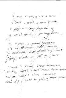
In our post editing process of our main task we mainly used after effect to create the wished effects. Since our sequence is a title sequence, we decided to set the whole thing up as if it were a diary entry and used hand written ‘diary entries’ to create a very stylized title sequence. When we started using after effects I thought it was very difficult to use but through quite a bit of work I got my head around it and I am very pleased with the results which we have achieved so far. Compared to our preliminary task I think that we have really improved our use of skills for post production. In our preliminary task we just used final cut and tried to piece the storyboard together to make it work. For our main task we first struggled a little to get it into an order and structure which we were happy with before we blew it up to HD and put it into After Effects. We made it a little easier for ourselves because we didn’t use any people in our main task which ensured the correct continuity of certain shots, which was one thing which we struggled with in our Preliminary task. In terms of the use of final cut I think we have become quicker and a little more efficient in our working since our preliminary task and it was also easier to keep our shots the same length and speed since our subjects didn’t keep moving. We applied certain effects and transitions in Final Cut which we had no idea of when we were doing our prelim task so I think we have become more flexible in the use of final cut. 
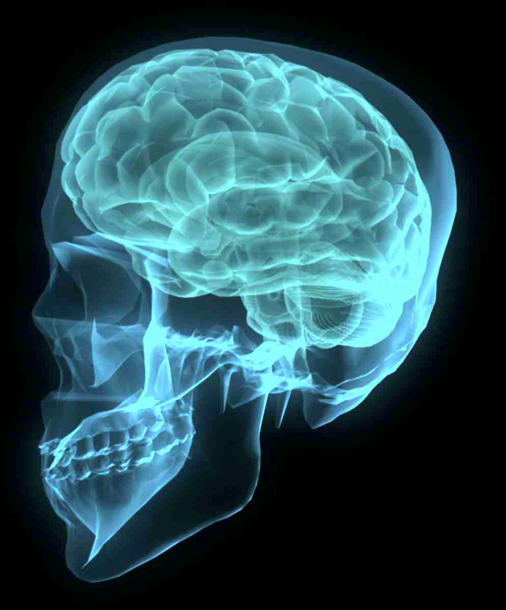
In our post production process we realized that all of our shots had a brown base colour and it all looked quite dull. Therefore we decided to stylize it by changing the hue of most of our shots going over the colour scheme from blue over purple, to red and ending up with black and white. Since this title sequence is a little journey through our characters mental state of mind and she goes crazy by the end, we decided to fit the colours accordingly. Blue is a very cool and calm colour representing a calm state of mind and very sad emotions. In our next shot we have a dark purple which represents the beginning of her depressions and anger and after that we have a red base colour which represents plain fury, fear and depression. Right at the end in our last shot we decided to make it black and white representing her losing her mind and having been tipped over the edge at the thought of aging. I think this colour scheme gave our sequence a little more depth and interesting aspects. Additionally to this we also added certain layers of writing from the ‘diary‘ and also a couple of layers of interesting paper surfaces. This created a more stylized effect and it now looks more like a title sequence as it doesn’t have a plot and we have stopped trying to make sense of everything. This new version looks a lot more interesting and it is also a proper title sequence, including all of the titles needed, integrating them in a more interesting way. I have to admit that I thought that our sequence was very boring before we put it through after effects because of its dull colour and lack of anything happening. Now that we have integrated the idea of the person having huge problems with aging and going insane under the pressure I think it could actually be the opening of a proper film. Due to its artistic nature we decided that it needed a certain style in order to make it look more professional. This was quite difficult to create for us since the base colour of all our shots was brown which made them partially quite dull. Therefore we started thinking about what we could do to make it more interesting to watch. During one of our lessons two people from our group started doing research on what reminded them of our sequence and they came up with different styles of pictures throughout. Some where medical records and scans of brains and others were edited and montaged pictures which were quite scientific, also representing the psychological link.


From these we started thinking about either making it a medical condition which is more physical than mental or making it a more psychological issue. In the end we decided that to a certain extent we could link both of those and we then also decided the structure of our sequence. This is that we have one shot and transformation with titles, then pictures of medical records, then another shot and transformation with titles, and some more mdeical records, and so on all the way through the sequence. This makes the whole sequence a bit more thematic and realistic in a way since it was quite lifeless and dull beforehand. Since it is a thematic title sequence we tried to create a certain style during our shoot and I think in terms of camera work and ideas this worked well, I do believe though that we maybe should have been more careful with the use of colour and adjusted our mise en scene accordingly.
The purpose of our title sequence is to show the audience the style of the movie and prepare them for the main part of it. There is no narrative in our opening sequence which means that the audience can't really be drawn into it. Therefore we just feed the audience examples of the main character's condition and introduce the cast and crew working for the film.


In terms of sound in our sequence we also tried to adjust the style to the pictures. The style of sound we used were ambient soundtracks, just creating a background sound for our sequence. This gives it an eerie and slightly mysterious feeling when you watch the clip. In this sequence we have in fact no diegetic sounds at all and all it depends on is the use of ambient music to set the mood. Another thing we addd to the soundtrack was talking where we recorded someone reading out our diary entries. We then layered the voices over one another creating a whisper of voices and aiming to confuse the audience in a way. So overall we have a rumble of ambient music which just forms a base for the soundtrack, over the top of that we have two or sometimes three layers at a time of a voice speaking at different levels.    


For the titles in our sequence we first thought that we would use quite ordinary titles throughout our sequence. We then decided that we would have handwritten titles instead which we did in the same way as our diary entries. We got one member of our group to write them, then I took a picture and then we edited them in after effects and photoshop to make it look better. For our titles we initially thought that we would write the names in capital letters adn the jobs in lower case writing. We then thought it looked a bit too clumsy and although people actually read the title more thoroughly when it is in capital letters we decided to highlight the names based on the size of the writing. I think our titles work really well because they fit in with the diary style of it and continued the strongly stylized feel to it the whole way through. 


Overall I think most of our sequence was created through after effects since we didn't use that much footage at all. Since our target audience are teenagers from 15-25 and people who are into arty films I think the style which we used works very well. The style is quite modern which appeals to our young target audience and it is also arty and a little abstract which appeals to the other part of our target audience. Our whole sequence is quite slow and flowing which means that we also chose to adjust the music accordingly along with the way the titles appear and disappear. The whole sequence is based on our titles since it is a title sequence and this is why we focused everything on the style of the sequence and the speed, creating a nice smooth effect and an eerie feeling.