Overall I think I can say that the editing process is one of the most important parts of our thriller. Since it is a title sequence we need to focus especially on the integration of titles and due to the style of the sequence there is a lot of work which needs to be done in after effects.
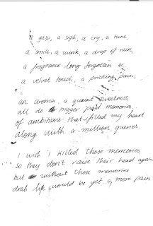
 In our post editing process of our main task we mainly used after effect to create the wished effects. Since our sequence is a title sequence, we decided to set the whole thing up as if it were a diary entry and used hand written ‘diary entries’ to create a very stylized title sequence. When we started using after effects I thought it was very difficult to use but through quite a bit of work I got my head around it and I am very pleased with the results which we have achieved so far. Compared to our preliminary task I think that we have really improved our use of skills for post production. In our preliminary task we just used final cut and tried to piece the storyboard together to make it work. For our main task we first struggled a little to get it into an order and structure which we were happy with before we blew it up to HD and put it into After Effects. We made it a little easier for ourselves because we didn’t use any people in our main task which ensured the correct continuity of certain shots, which was one thing which we struggled with in our Preliminary task. In terms of the use of final cut I think we have become quicker and a little more efficient in our working since our preliminary task and it was also easier to keep our shots the same length and speed since our subjects didn’t keep moving. We applied certain effects and transitions in Final Cut which we had no idea of when we were doing our prelim task so I think we have become more flexible in the use of final cut.
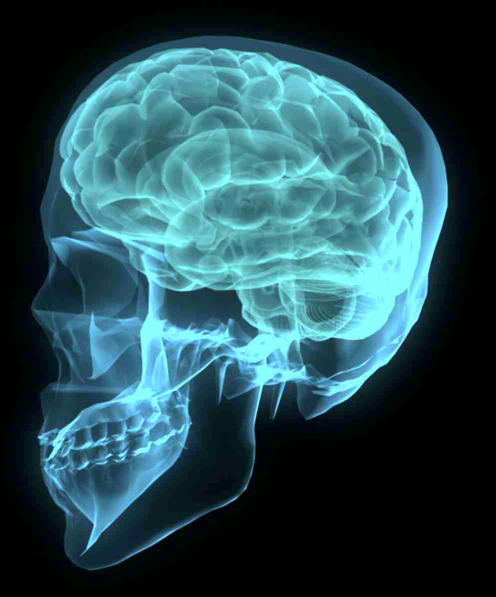
 In our post production process we realized that all of our shots had a brown base colour and it all looked quite dull. Therefore we decided to stylize it by changing the hue of most of our shots going over the colour scheme from blue over purple, to red and ending up with black and white. Since this title sequence is a little journey through our characters mental state of mind and she goes crazy by the end, we decided to fit the colours accordingly. Blue is a very cool and calm colour representing a calm state of mind and very sad emotions. In our next shot we have a dark purple which represents the beginning of her depressions and anger and after that we have a red base colour which represents plain fury, fear and depression. Right at the end in our last shot we decided to make it black and white representing her losing her mind and having been tipped over the edge at the thought of aging. I think this colour scheme gave our sequence a little more depth and interesting aspects. Additionally to this we also added certain layers of writing from the ‘diary‘ and also a couple of layers of interesting paper surfaces. This created a more stylized effect and it now looks more like a title sequence as it doesn’t have a plot and we have stopped trying to make sense of everything. This new version looks a lot more interesting and it is also a proper title sequence, including all of the titles needed, integrating them in a more interesting way. I have to admit that I thought that our sequence was very boring before we put it through after effects because of its dull colour and lack of anything happening. Now that we have integrated the idea of the person having huge problems with aging and going insane under the pressure I think it could actually be the opening of a proper film. Due to its artistic nature we decided that it needed a certain style in order to make it look more professional. This was quite difficult to create for us since the base colour of all our shots was brown which made them partially quite dull. Therefore we started thinking about what we could do to make it more interesting to watch. During one of our lessons two people from our group started doing research on what reminded them of our sequence and they came up with different styles of pictures throughout. Some where medical records and scans of brains and others were edited and montaged pictures which were quite scientific, also representing the psychological link.

From these we started thinking about either making it a medical condition which is more physical than mental or making it a more psychological issue. In the end we decided that to a certain extent we could link both of those and we then also decided the structure of our sequence. This is that we have one shot and transformation with titles, then pictures of medical records, then another shot and transformation with titles, and some more mdeical records, and so on all the way through the sequence. This makes the whole sequence a bit more thematic and realistic in a way since it was quite lifeless and dull beforehand. Since it is a thematic title sequence we tried to create a certain style during our shoot and I think in terms of camera work and ideas this worked well, I do believe though that we maybe should have been more careful with the use of colour and adjusted our mise en scene accordingly.
The purpose of our title sequence is to show the audience the style of the movie and prepare them for the main part of it. There is no narrative in our opening sequence which means that the audience can't really be drawn into it. Therefore we just feed the audience examples of the main character's condition and introduce the cast and crew working for the film.
In terms of sound in our sequence we also tried to adjust the style to the pictures. The style of sound we used were ambient soundtracks, just creating a background sound for our sequence. This gives it an eerie and slightly mysterious feeling when you watch the clip. In this sequence we have in fact no diegetic sounds at all and all it depends on is the use of ambient music to set the mood. Another thing we addd to the soundtrack was talking where we recorded someone reading out our diary entries. We then layered the voices over one another creating a whisper of voices and aiming to confuse the audience in a way. So overall we have a rumble of ambient music which just forms a base for the soundtrack, over the top of that we have two or sometimes three layers at a time of a voice speaking at different levels.
For the titles in our sequence we first thought that we would use quite ordinary titles throughout our sequence. We then decided that we would have handwritten titles instead which we did in the same way as our diary entries. We got one member of our group to write them, then I took a picture and then we edited them in after effects and photoshop to make it look better. For our titles we initially thought that we would write the names in capital letters adn the jobs in lower case writing. We then thought it looked a bit too clumsy and although people actually read the title more thoroughly when it is in capital letters we decided to highlight the names based on the size of the writing. I think our titles work really well because they fit in with the diary style of it and continued the strongly stylized feel to it the whole way through.
Overall I think most of our sequence was created through after effects since we didn't use that much footage at all. Since our target audience are teenagers from 15-25 and people who are into arty films I think the style which we used works very well. The style is quite modern which appeals to our young target audience and it is also arty and a little abstract which appeals to the other part of our target audience. Our whole sequence is quite slow and flowing which means that we also chose to adjust the music accordingly along with the way the titles appear and disappear. The whole sequence is based on our titles since it is a title sequence and this is why we focused everything on the style of the sequence and the speed, creating a nice smooth effect and an eerie feeling.


No comments:
Post a Comment