For our Digipak design, we started to design a cover each, trying to find the right style for the cover. After designing our own CD covers, we all looked at each one and started cominh up with an overall concept, using certain parts from each design.
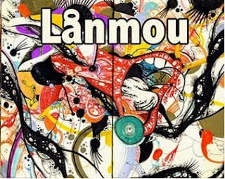 This is the very first cover we designed. This cover was designed by our whole group. I quite like it as it is a visually interesting, yet quite simple design. The graphics behind the writing were taken from teh internet, and it fit well with our original concept, until we changed it.
 This cover was designed by Will Day, using the sea to show their relaxed attitude and their image, along with the crowd to show their popularity. I really like the simplicity of the font on this design and I think it would be good to use for our final design.
 This cover was designed by Richard Hill. Once again this is a very simple cover, and that's exactly what I like about it. I love the colour schemes used, since it moves very much within the blue and green range, and due to the picture I think it would fit quite well to our band. The only problem I see with this is that it might be too individual for our band since it looks more like a radio head cover. I do think that we could use the colour scheme for our final design.
 This is the CD cover which I designed. I used the lights because it reminded me of a house party, and therefore represented our video, which therefore also represented the image we were setting up for it. Then I put the girl in it, also reminding of the video, although I think that for a debut album we should put the band member on the digipak rather than the girl starring in the video. Then I also used a mix of different bodypaints in UV paint which represented the casual yet indie image of our band. I think in our final design we might make use of the lights and possibly of the colour scheme.
 This cover was also designed by Will Day. What I like about it is the use of different colours on it, reminding f a colour wheel and in terms of colour I think our final design might end up looking a bit like this. I don't think however that we will be able to use that writing, as it might not work with our design, and I'm not sure the colour will work either. I like the simplicity of the design.
 This Cover was designed by Richard Hill. I really like the background of the cover. He made use of the little party lights which we might use for our final design and which I also used for my album cover. Also the use of the moon reminds of the image of the band, although there was also a big focus on the moon in the original MGMT video, which is probably why we won't use it in our design. I am also not sure about the writing, it is too agressive for that kind of design.
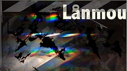
 This cover was designed by Ian Heritier. I like the rainbow scheme of colours in the middle of it and it might be used for our final design as well. I am not sure about the rest though since it is very dark and possibly too agressive for the image we are going for. I quite like the simplicity of the writing and I hope we might use it in our final design as well.
After designing our own album covers we also started really researching into existing artists and their album covers. There are certain conventions for digipaks which have to be kept up, in order to fulfil the audience's expectations.
 Every digipak should contain the artist's name, the title of the album, the titles of the different songs, the price or bar code, if it's a debut band an image of the band. There are also certain 'rules' which are normally applied to digipaks. They normally make use of four to six colours and two different fonts. And normally the song titles are the same font as the album title.
Except for the layout, you also have to think about the meaning behind your album cover. Often album covers are Polysemic- meaning that they are open to different interpretations. The album cover should link to the style (both music and star persona) in which you are selling your artist. So a cover for a pop star will look different than a cover for an emo band. In order to alert the audience to your album cover if they are just skimmingcertain ones, you need a good design. Often artistic directors use intertextual references to make the audience 'identify' and also to show creativity and give the viewer a certain sense of familiarity through the use of those links. One very common intertextuality is the use of fine art to inspire album covers.

For example, Silverchair used a Mondrian inspired album cover to sell their album 'Young Modern'. This works well together since the title is 'Young Modern' and Mondrian's work is considered to be very modern, due to his use of vivid colours and shapes.

Milla Jovovich then used a religious painting to illustrate her album cover for 'The Divine Comedy'. This is an intertextual reference to Dante's epic poem on the afterlife, which was written in the 14th century. The painting also shows a version of the afterlife, which links the title of the album to the painting used to illustrate it. The naked woman on the cover, sells her star persona in a way since it sexualizes the album, although that is the original painting.

For this album cover, the intertextual reference used, was to link her cover to Andy Warhole's work. The style of his work was pop art, possibly linking to the fact that Madonna is a Pop artist, linking in a word play. Warhole's most famous pieces of work include pop art pictures of Marylin Monroe which this is quite clearly referencing to, even in terms of the hairstyle and the beauty mark. By using this intertextual reference Madonna is selling herself as an iconic figure.
In terms of intertextual reference I have to admit that we have not been as creative and clever about our digipak designs. We have purely gone for the visual representation of our artist's style which probably works quite well for us, as we are promoting a debut album. So overall I think the research we did into different album covers is really interesting and helpful to inspire our use of style, but at the moment we are not making many intertextual references.

 This cover was designed by Will Day, using the sea to show their relaxed attitude and their image, along with the crowd to show their popularity. I really like the simplicity of the font on this design and I think it would be good to use for our final design.


After designing our own album covers we also started really researching into existing artists and their album covers. There are certain conventions for digipaks which have to be kept up, in order to fulfil the audience's expectations.

Except for the layout, you also have to think about the meaning behind your album cover. Often album covers are Polysemic- meaning that they are open to different interpretations. The album cover should link to the style (both music and star persona) in which you are selling your artist. So a cover for a pop star will look different than a cover for an emo band. In order to alert the audience to your album cover if they are just skimmingcertain ones, you need a good design. Often artistic directors use intertextual references to make the audience 'identify' and also to show creativity and give the viewer a certain sense of familiarity through the use of those links. One very common intertextuality is the use of fine art to inspire album covers.

For example, Silverchair used a Mondrian inspired album cover to sell their album 'Young Modern'. This works well together since the title is 'Young Modern' and Mondrian's work is considered to be very modern, due to his use of vivid colours and shapes.

Milla Jovovich then used a religious painting to illustrate her album cover for 'The Divine Comedy'. This is an intertextual reference to Dante's epic poem on the afterlife, which was written in the 14th century. The painting also shows a version of the afterlife, which links the title of the album to the painting used to illustrate it. The naked woman on the cover, sells her star persona in a way since it sexualizes the album, although that is the original painting.

For this album cover, the intertextual reference used, was to link her cover to Andy Warhole's work. The style of his work was pop art, possibly linking to the fact that Madonna is a Pop artist, linking in a word play. Warhole's most famous pieces of work include pop art pictures of Marylin Monroe which this is quite clearly referencing to, even in terms of the hairstyle and the beauty mark. By using this intertextual reference Madonna is selling herself as an iconic figure.
In terms of intertextual reference I have to admit that we have not been as creative and clever about our digipak designs. We have purely gone for the visual representation of our artist's style which probably works quite well for us, as we are promoting a debut album. So overall I think the research we did into different album covers is really interesting and helpful to inspire our use of style, but at the moment we are not making many intertextual references.
No comments:
Post a Comment