A proficient and selective account of the shoot day. I think that you have been careful and selective with your comments which highlight your participation and direction of the shoot day. Do you have any images that can be posted with your evaluation? Also what technologies were used? How creative was this as a production process? Well done
Sunday 27 November 2011
Thursday 24 November 2011
Account of Shoot Day
We had our shoot day on Friday the 18th of November, 2011. For this day we obviously had to prepare a lot. This ranged from building the set to choosing the costume and to sorting out our props.
We tried to build as much of the set as we could the night before our shoot day. We had a slight problem time wise since the group before us could only start around mid day, so they could only finish by 6.30pm. This meant that we could only start setting up at about 7 o'clock. During the two hours in which we set up we started by carrying in the raised floor, then we set up the walls around them. We did this so we could build in the right kind of lighting for our 'electric feel' sequence of the video which had to be particularly colourful. We set up the walls for three sides of the set, leaving out a bit upstage centre in order to include a bay window. We then covered the basic walls with cardboard sheets since we could not put the wall paper on the walls themselves. After screwing the cardboard boards to the walls we started wallpapering them. This was a very time consuming task since it included precision and careful measurements in order to fit the pattern of the bits of wall paper together in order to link. We stuck the wallpaper on the cardboard, using a special type of glue, which needed to be pencilled on the back. After that we just put the carpet on the floor and we had our basic living room as we wanted it. Overall I think that we were very effective and precise in building our set and I was very happy with the outcome. We ended up with a room which looked like an old fashioned living room which was exactly the type of thing which we were hoping for since our video is set in a house party.
The next morning we finished our set as quickly as we could by arranging the furniture, the band and any other lighting constructions which we hadn't done by then. Whilst the other three members of my group were doing this, I went to the dance studio and started rehearsing with the dancers. Since I am not that much of a dancer, they had come up with a thirty second dance for our video, fitting the main beat of it which meant that we could use it anywhere we wanted. We went through the dance a couple of times until everybody was happy with it and then they started putting on their costumes and make up. Meanwhile I went to find the other members of our cast to get them ready as well. I asked the three members of our band to start rehearsing together in order to get used to playing together since they had never done that before. After that I then asked our two main characters to get into their costume. Whilst the set was being set up and everybody else was rehearsing I then started painting our Electric Girl with UV paint, in order to make her stand out from the rest of them. Luckily we all finished at the same time and could start shooting pretty much on schedule. I think that we were also pretty efficient with the preparations in the morning since we managed to get everything done pretty quickly.
Around 10 o'clock we actually started shooting. Richard was doing the camera and I was directing and doing the playback. We started by doing the normal party scene which included introducing the viewer to the house party and introducing the connection between our two main characters, leading up to the kiss. We knew which shots we wanted to do and came up with little pieces of plot whilst going along which resulted in more material which we could use overall. We also had some shots which had to be cut as they were logistically not possible to do, such as the shot of our protagonist tripping over the sofa as he was following her. We encountered a bit of time pressure since we knew we only had the dancers until lunch time which meant we had to get the non electric feel section and the electric feel section pretty much done before lunch. Except for the fact that we would have lost the dancers at lunchtime, the were a very big part of our party, which meant that it would have looked very empty if we hadn't had them for any of the narrative. So after we got the first section done, we then decorated everything for the 'Electric Feel' part. This included painting the dancers, which took quite a while, and it also included trying to get UV on the rest of our cast too. We ordered UV bracelets and necklaces, UV contact lenses (worn by our protagonist Andrew) and UV paint which all made the party look more interesting, creating the juxtaposed contrast between the first section and the second section of the video.
Once the UV paint arrived and we borrowed some from the theatre department, we had to test it on all of our cast in order to see whether anyone got an allergic reaction to it. To find that out we went around and applied different colours to different people the day before, which would have given us enough time to find a solution if there had been a problem. Luckily it all went well and everybody was fine with it.
After making the necessary to our set and cast we started recording the second part of our video. This started with the dancers. We put them on the set and looked at the image we got on camera. The lights we had switched on were the lights around the sides of our set and a couple of extra lights spinning around and projecting patters on the walls. Along with that we obviously also had our UV light turned on which made the paint come out very nicely in the shot. When looking at the shot I decided that the lights on the sides were too much for the dancing shot so we turned those of. We ended up only having the UV light and the moving projectors. Once we had established the lighting set up for this and had increased the aperture on the camera in order to slightlylighten the image up, bringing out the paint and features of our dancers more clearly, we started shooting it. We did a wide of all of the dancers, a close up of every single one and a couple of detail shots, which we could include in our video.
After we finished with filming the dancers, we started shooting the performance aspect. First we did the 'normal ' half of it where we covered all the shots we had planned, and featured each band member and appropriate amount of time. After that we then did the 'electric feel' half of the performance aspect where we had to change the lighting and use some more interesting shots in order to convey the excitement of the second half of the video. After filming all the planned shots on the band, we just filmed the rest of the party and tried to get as many shots of the electric feel party going on as we could, in order to stock up on narrative and material.
Overall I think that this was a very successful shoot day and we got everything done which we needed to do. It was a very stressful day for me, mainly directing whilst the others were filming and standing in for people in the actual video. I think we could have gotten more narrative shots than we did in order to have a stronger evidence of it throughout the whole video. But overall I am very happy with the material we got and the range of shots which we managed to collect. The fact that we have such a big range of shots is going to make it easier for us when we are in post production.
Saturday 19 November 2011
Teacher Feedback
This is an excellent account of the process of the construction of the CD digipak and poster. You are able to link the design of your ancillary tasks to real media practice. This is well reflected upon. I feel that you have fully evaluated the design at this stage and importantly posted audience feedback on this. Nonetheless the digipak and poster fit really well as a campaign - well done!
Wednesday 16 November 2011
Poster Evaluation
We all had some idea about the design of our poster, but before we started doing it we did some research on different kinds of band posters, in order to know what information needed to be on there. We found out that most of the band posters had mainly images of the band and the band name on them so that is what we started doing. We then realized that only bands which had already established their image really managed to just put their name on it, but since our poster was an advert for their debut album we had to put some additional information on there.
 This is a poster of a band which is already pretty well known, and is therefore just advertising itself rather than their debut album. Except for the band name and the three band members there is no information of there and the style is established purely through the costumes worn by the band members and the colour scheme of the poster.
 This is the type of poster we are going for. It advertises her new album, tells the audience a little bit about what it is, where it is sold and at the bottom it lists all the copy rights. The problem we will have with that is mainly due to the design element, as our poster is already quite busy and I think to many labels might ruin it a bit aesthetically. I will however try to adjust it in order to fit the titles in. Similarily to us the poster reflects the design of the album cover and reminds the audience what was being advertised.
This is another album release poster, this time by George Michael. Apart from a picture of him on the front, selling the album itself, it tells us a bit of imnformation about the album (i.e. what it is featuring) and when It is going to be in stores.


This is another album release poster, this time by George Michael. Apart from a picture of him on the front, selling the album itself, it tells us a bit of imnformation about the album (i.e. what it is featuring) and when It is going to be in stores.

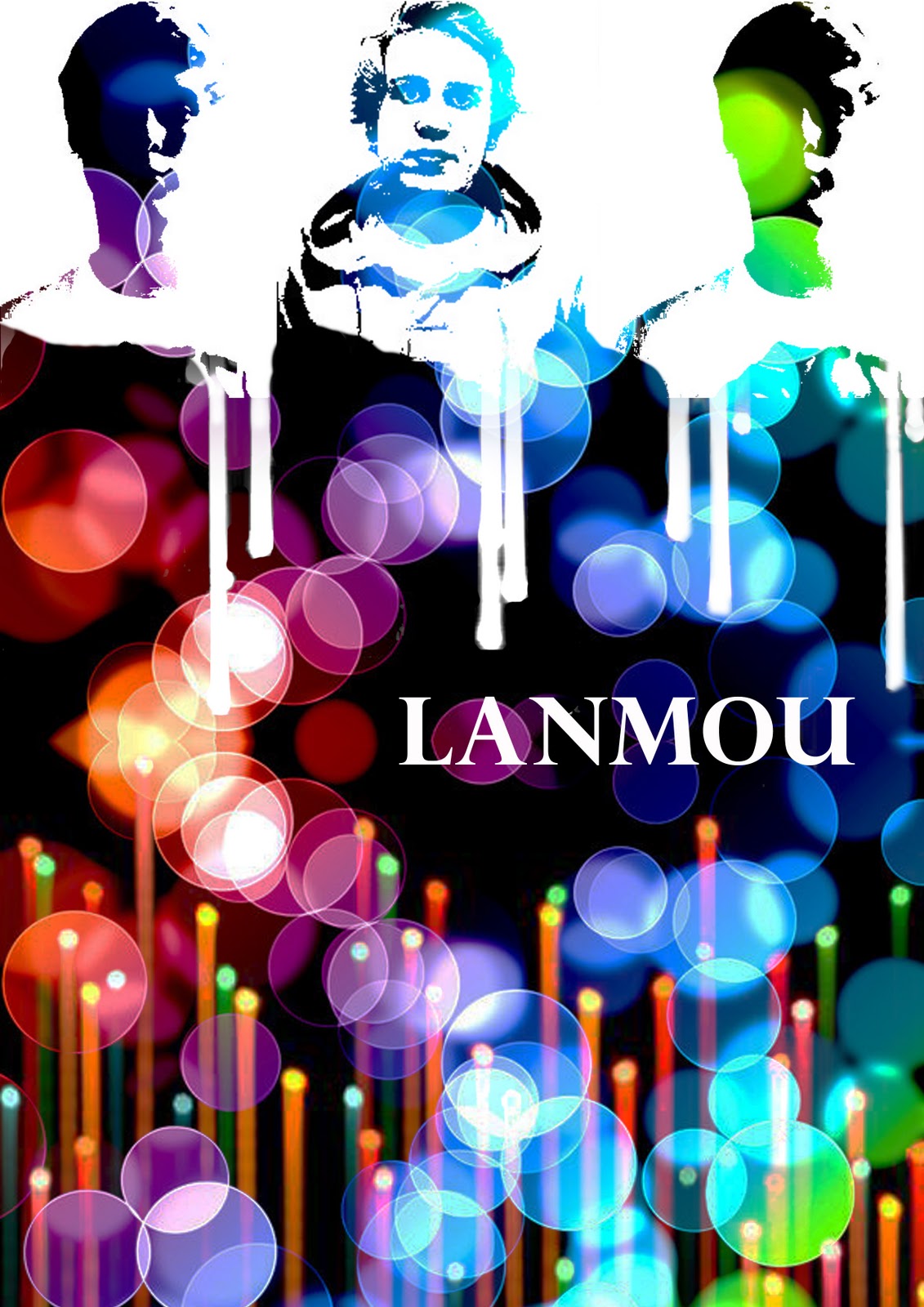
For our album cover, we tried to stick with a similar theme, of having a recognisable design on the poster. We did this so the audience would link the album and the poster once they had seen it. The background for the poster is the same as the one for the digipak just that we had to duplicate it and flip it so it would fill up the screen and merge together. Then we put the stencils of the band members on there and arranged them at the top. Once I had done that I realized that the change between the stencils and the background doesn't look good so I changed it into having the images 'drip' down. I did this by using the light beams which we had already used before, and using selective colour to turn them white. Then I turned them upside down and erased part which weren't needed and ended up with the dripping effect on the photos.

Then I put in the title which we already used on our CD cover and wrote below 'Their new Album featuring 'Electric Feel' / In Stores December 12th'. Then at the bottom I put in the EMI logo and the copyrights small print which we already had on our digipak.
Overall I'm really happy with our poster and I think that I works in terms of representing the band for the debut album. I like the simplicity of it, but I wish we hadn't needed to put in anything apart from the band and album title. I think however that the solution we have found for this works well and it still looks good.
Tuesday 15 November 2011
Other poster designs
These are the poster designs which some of the other members of the group came up with:
Richard:
 I like the use of radiant colour in this design of the poster, although I don't think we should steer away from the basic design of our digipak. We would also need to put the band members on there and just because of the straight beams of light it might not be very easy on the eye.
Will:
 This is another design of the poster which Will came up with. I like the thematic UV painted people in this although I think we should still stick with the original digipak background and font. This would help the audience remember the band, purely due to the use of synergy.
Richard:

Will:

Final Digipak design- except for the band members
This is our final digipak design, with the exception for our actual band members. We encountered a problem because one of our band members could not do it on short term notice so we had to find a substitute. We are going to do the photoshoot for that on wednesday.


Monday 14 November 2011
Poster Design
This is the poster design which we came up with, although we still have to edit in our actual band members, which we cannot do right now since we haven't had our photoshoot yet.

Friday 11 November 2011
Digipak Design
We had many different ideas for our digipak and did many different drafts. One which we decided to stick with was a combination of different ideas, floating about in the group. For instance we used a similar background to the one I used, we used a similar colour scheme from another member of our group and the style of it from a third. Overall I am pretty happy with the design which we came up with and I think that especially the recent improvements make it look nice and easy on the eye. This is one of the earlier designs of the Digipak:

 We have a very prominent use of colour, which reflects the video of the single we are marketing, and therefore of the band. I think that the digipak is visually attractive and it is interesting to look at. For both the fron cover and the back cover we used the same background and then put the 'Lighten' Filter over it in photoshop. For the fron cover we also used another image, which is what is creating those lines and put another filter over it to create the effect we achieved here. For the inside left we took pictures of each of our band members and created stencils of them. We then put them on top of the original background and filtered them to make the black in the stencils transparent and show the background of the cover. Since we had already established the colour and white theme, we decided to be consistent and use white for our writing too. The writing on the back is a very simple and modern type of writing, which I think works well as it is subtle but yet attracts your attention to the song titles. The title on the front reminds of stencils and therefore fits in with the already established theme. After having created the basic layout and design of the cover we put the bar code in the right hand corner on the back of the digipak alongside with a production logo.
This is the back of our digipak with the right production logo this time. After we put the columbia logo on because the original band MGMT is marketed by columbia, we remembered that our band would be marketed by EMI. So we went on the internet and looked for the right logo. There were many different stylized versions of it, but we decided to go with the original old fashioned one just to show the audience straight away we were signed with EMI. Another adjustment we made was the order of the songs on the back. When looking at it we realized that the white writing on the light grey background is not very easy on the eye. You could read it fine but it just looked nicer when we switched some of the longer names with the shorter names, avoiding any light grey background below the writing.

We then looked at the inside right of our digipak and tried to come up with a good design for it. We all liked the idea of having an 8track behind our CD and our initial idea was to just have it behind the Cd as it is here(left). We then decided that it did not work in terms of style and therefore made some adjustments to it.
We manipulated the diagram (right) to look more authentic in terms of the use of style and colour and it ended up looking like this:

I think it fits in very well and sums up the colour scheme in a way. After having designed this we put it all together and came up with our final digipak design. Once we had turned the 8track pink we thought we should turn the stencils pink as well, just to have some sort of colour scheme in our design.
Overall I really like the design of our digipak and I think it works very well with the image we are creating through our music video. The use of vibrant colour is reflected by the second section of our music video, which is also extremely colourful and slightly weird.
Overall I really like the design of our digipak and I think it works very well with the image we are creating through our music video. The use of vibrant colour is reflected by the second section of our music video, which is also extremely colourful and slightly weird.
Subscribe to:
Posts (Atom)