A proficient and selective account of the shoot day. I think that you have been careful and selective with your comments which highlight your participation and direction of the shoot day. Do you have any images that can be posted with your evaluation? Also what technologies were used? How creative was this as a production process? Well done
Sunday 27 November 2011
Thursday 24 November 2011
Account of Shoot Day
We had our shoot day on Friday the 18th of November, 2011. For this day we obviously had to prepare a lot. This ranged from building the set to choosing the costume and to sorting out our props.
We tried to build as much of the set as we could the night before our shoot day. We had a slight problem time wise since the group before us could only start around mid day, so they could only finish by 6.30pm. This meant that we could only start setting up at about 7 o'clock. During the two hours in which we set up we started by carrying in the raised floor, then we set up the walls around them. We did this so we could build in the right kind of lighting for our 'electric feel' sequence of the video which had to be particularly colourful. We set up the walls for three sides of the set, leaving out a bit upstage centre in order to include a bay window. We then covered the basic walls with cardboard sheets since we could not put the wall paper on the walls themselves. After screwing the cardboard boards to the walls we started wallpapering them. This was a very time consuming task since it included precision and careful measurements in order to fit the pattern of the bits of wall paper together in order to link. We stuck the wallpaper on the cardboard, using a special type of glue, which needed to be pencilled on the back. After that we just put the carpet on the floor and we had our basic living room as we wanted it. Overall I think that we were very effective and precise in building our set and I was very happy with the outcome. We ended up with a room which looked like an old fashioned living room which was exactly the type of thing which we were hoping for since our video is set in a house party.
The next morning we finished our set as quickly as we could by arranging the furniture, the band and any other lighting constructions which we hadn't done by then. Whilst the other three members of my group were doing this, I went to the dance studio and started rehearsing with the dancers. Since I am not that much of a dancer, they had come up with a thirty second dance for our video, fitting the main beat of it which meant that we could use it anywhere we wanted. We went through the dance a couple of times until everybody was happy with it and then they started putting on their costumes and make up. Meanwhile I went to find the other members of our cast to get them ready as well. I asked the three members of our band to start rehearsing together in order to get used to playing together since they had never done that before. After that I then asked our two main characters to get into their costume. Whilst the set was being set up and everybody else was rehearsing I then started painting our Electric Girl with UV paint, in order to make her stand out from the rest of them. Luckily we all finished at the same time and could start shooting pretty much on schedule. I think that we were also pretty efficient with the preparations in the morning since we managed to get everything done pretty quickly.
Around 10 o'clock we actually started shooting. Richard was doing the camera and I was directing and doing the playback. We started by doing the normal party scene which included introducing the viewer to the house party and introducing the connection between our two main characters, leading up to the kiss. We knew which shots we wanted to do and came up with little pieces of plot whilst going along which resulted in more material which we could use overall. We also had some shots which had to be cut as they were logistically not possible to do, such as the shot of our protagonist tripping over the sofa as he was following her. We encountered a bit of time pressure since we knew we only had the dancers until lunch time which meant we had to get the non electric feel section and the electric feel section pretty much done before lunch. Except for the fact that we would have lost the dancers at lunchtime, the were a very big part of our party, which meant that it would have looked very empty if we hadn't had them for any of the narrative. So after we got the first section done, we then decorated everything for the 'Electric Feel' part. This included painting the dancers, which took quite a while, and it also included trying to get UV on the rest of our cast too. We ordered UV bracelets and necklaces, UV contact lenses (worn by our protagonist Andrew) and UV paint which all made the party look more interesting, creating the juxtaposed contrast between the first section and the second section of the video.
Once the UV paint arrived and we borrowed some from the theatre department, we had to test it on all of our cast in order to see whether anyone got an allergic reaction to it. To find that out we went around and applied different colours to different people the day before, which would have given us enough time to find a solution if there had been a problem. Luckily it all went well and everybody was fine with it.
After making the necessary to our set and cast we started recording the second part of our video. This started with the dancers. We put them on the set and looked at the image we got on camera. The lights we had switched on were the lights around the sides of our set and a couple of extra lights spinning around and projecting patters on the walls. Along with that we obviously also had our UV light turned on which made the paint come out very nicely in the shot. When looking at the shot I decided that the lights on the sides were too much for the dancing shot so we turned those of. We ended up only having the UV light and the moving projectors. Once we had established the lighting set up for this and had increased the aperture on the camera in order to slightlylighten the image up, bringing out the paint and features of our dancers more clearly, we started shooting it. We did a wide of all of the dancers, a close up of every single one and a couple of detail shots, which we could include in our video.
After we finished with filming the dancers, we started shooting the performance aspect. First we did the 'normal ' half of it where we covered all the shots we had planned, and featured each band member and appropriate amount of time. After that we then did the 'electric feel' half of the performance aspect where we had to change the lighting and use some more interesting shots in order to convey the excitement of the second half of the video. After filming all the planned shots on the band, we just filmed the rest of the party and tried to get as many shots of the electric feel party going on as we could, in order to stock up on narrative and material.
Overall I think that this was a very successful shoot day and we got everything done which we needed to do. It was a very stressful day for me, mainly directing whilst the others were filming and standing in for people in the actual video. I think we could have gotten more narrative shots than we did in order to have a stronger evidence of it throughout the whole video. But overall I am very happy with the material we got and the range of shots which we managed to collect. The fact that we have such a big range of shots is going to make it easier for us when we are in post production.
Saturday 19 November 2011
Teacher Feedback
This is an excellent account of the process of the construction of the CD digipak and poster. You are able to link the design of your ancillary tasks to real media practice. This is well reflected upon. I feel that you have fully evaluated the design at this stage and importantly posted audience feedback on this. Nonetheless the digipak and poster fit really well as a campaign - well done!
Wednesday 16 November 2011
Poster Evaluation
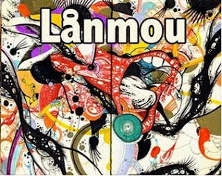
We all had some idea about the design of our poster, but before we started doing it we did some research on different kinds of band posters, in order to know what information needed to be on there. We found out that most of the band posters had mainly images of the band and the band name on them so that is what we started doing. We then realized that only bands which had already established their image really managed to just put their name on it, but since our poster was an advert for their debut album we had to put some additional information on there.
 This is a poster of a band which is already pretty well known, and is therefore just advertising itself rather than their debut album. Except for the band name and the three band members there is no information of there and the style is established purely through the costumes worn by the band members and the colour scheme of the poster.
 This is the type of poster we are going for. It advertises her new album, tells the audience a little bit about what it is, where it is sold and at the bottom it lists all the copy rights. The problem we will have with that is mainly due to the design element, as our poster is already quite busy and I think to many labels might ruin it a bit aesthetically. I will however try to adjust it in order to fit the titles in. Similarily to us the poster reflects the design of the album cover and reminds the audience what was being advertised.
This is another album release poster, this time by George Michael. Apart from a picture of him on the front, selling the album itself, it tells us a bit of imnformation about the album (i.e. what it is featuring) and when It is going to be in stores.


This is another album release poster, this time by George Michael. Apart from a picture of him on the front, selling the album itself, it tells us a bit of imnformation about the album (i.e. what it is featuring) and when It is going to be in stores.

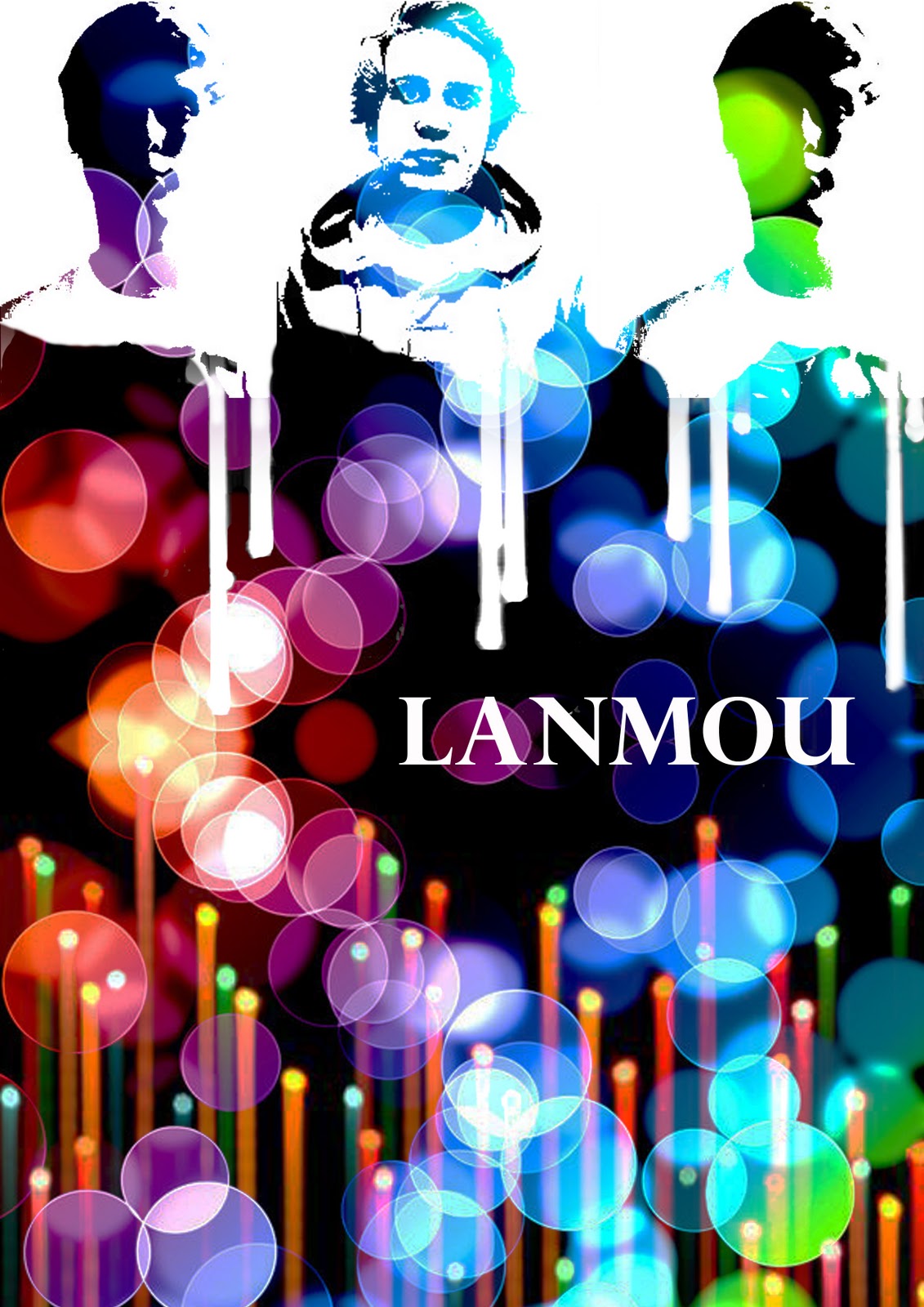
For our album cover, we tried to stick with a similar theme, of having a recognisable design on the poster. We did this so the audience would link the album and the poster once they had seen it. The background for the poster is the same as the one for the digipak just that we had to duplicate it and flip it so it would fill up the screen and merge together. Then we put the stencils of the band members on there and arranged them at the top. Once I had done that I realized that the change between the stencils and the background doesn't look good so I changed it into having the images 'drip' down. I did this by using the light beams which we had already used before, and using selective colour to turn them white. Then I turned them upside down and erased part which weren't needed and ended up with the dripping effect on the photos.

Then I put in the title which we already used on our CD cover and wrote below 'Their new Album featuring 'Electric Feel' / In Stores December 12th'. Then at the bottom I put in the EMI logo and the copyrights small print which we already had on our digipak.
Overall I'm really happy with our poster and I think that I works in terms of representing the band for the debut album. I like the simplicity of it, but I wish we hadn't needed to put in anything apart from the band and album title. I think however that the solution we have found for this works well and it still looks good.
Tuesday 15 November 2011
Other poster designs
These are the poster designs which some of the other members of the group came up with:
Richard:
 I like the use of radiant colour in this design of the poster, although I don't think we should steer away from the basic design of our digipak. We would also need to put the band members on there and just because of the straight beams of light it might not be very easy on the eye.
Will:
 This is another design of the poster which Will came up with. I like the thematic UV painted people in this although I think we should still stick with the original digipak background and font. This would help the audience remember the band, purely due to the use of synergy.
Richard:

Will:

Final Digipak design- except for the band members
This is our final digipak design, with the exception for our actual band members. We encountered a problem because one of our band members could not do it on short term notice so we had to find a substitute. We are going to do the photoshoot for that on wednesday.


Monday 14 November 2011
Poster Design
This is the poster design which we came up with, although we still have to edit in our actual band members, which we cannot do right now since we haven't had our photoshoot yet.

Friday 11 November 2011
Digipak Design
We had many different ideas for our digipak and did many different drafts. One which we decided to stick with was a combination of different ideas, floating about in the group. For instance we used a similar background to the one I used, we used a similar colour scheme from another member of our group and the style of it from a third. Overall I am pretty happy with the design which we came up with and I think that especially the recent improvements make it look nice and easy on the eye. This is one of the earlier designs of the Digipak:

 We have a very prominent use of colour, which reflects the video of the single we are marketing, and therefore of the band. I think that the digipak is visually attractive and it is interesting to look at. For both the fron cover and the back cover we used the same background and then put the 'Lighten' Filter over it in photoshop. For the fron cover we also used another image, which is what is creating those lines and put another filter over it to create the effect we achieved here. For the inside left we took pictures of each of our band members and created stencils of them. We then put them on top of the original background and filtered them to make the black in the stencils transparent and show the background of the cover. Since we had already established the colour and white theme, we decided to be consistent and use white for our writing too. The writing on the back is a very simple and modern type of writing, which I think works well as it is subtle but yet attracts your attention to the song titles. The title on the front reminds of stencils and therefore fits in with the already established theme. After having created the basic layout and design of the cover we put the bar code in the right hand corner on the back of the digipak alongside with a production logo.
This is the back of our digipak with the right production logo this time. After we put the columbia logo on because the original band MGMT is marketed by columbia, we remembered that our band would be marketed by EMI. So we went on the internet and looked for the right logo. There were many different stylized versions of it, but we decided to go with the original old fashioned one just to show the audience straight away we were signed with EMI. Another adjustment we made was the order of the songs on the back. When looking at it we realized that the white writing on the light grey background is not very easy on the eye. You could read it fine but it just looked nicer when we switched some of the longer names with the shorter names, avoiding any light grey background below the writing.

We then looked at the inside right of our digipak and tried to come up with a good design for it. We all liked the idea of having an 8track behind our CD and our initial idea was to just have it behind the Cd as it is here(left). We then decided that it did not work in terms of style and therefore made some adjustments to it.
We manipulated the diagram (right) to look more authentic in terms of the use of style and colour and it ended up looking like this:

I think it fits in very well and sums up the colour scheme in a way. After having designed this we put it all together and came up with our final digipak design. Once we had turned the 8track pink we thought we should turn the stencils pink as well, just to have some sort of colour scheme in our design.
Overall I really like the design of our digipak and I think it works very well with the image we are creating through our music video. The use of vibrant colour is reflected by the second section of our music video, which is also extremely colourful and slightly weird.
Overall I really like the design of our digipak and I think it works very well with the image we are creating through our music video. The use of vibrant colour is reflected by the second section of our music video, which is also extremely colourful and slightly weird.
Friday 21 October 2011
Feedback
A sound presentation of the CD digipak design and the importance of album covers - albeit concise woork. I feel that you could have developed research more into the conventions of Album digipak's and addressed layout and design more closely. What initial design's into CD covers for your group artist and consideration to target audience have you made?
Thursday 20 October 2011
Our digipak Design

This is the digipak design which we have come up with after our research and our final could probably look a bit like this.
Wednesday 19 October 2011
Digipak Research
For our Digipak design, we started to design a cover each, trying to find the right style for the cover. After designing our own CD covers, we all looked at each one and started cominh up with an overall concept, using certain parts from each design.
 This is the very first cover we designed. This cover was designed by our whole group. I quite like it as it is a visually interesting, yet quite simple design. The graphics behind the writing were taken from teh internet, and it fit well with our original concept, until we changed it.
 This cover was designed by Will Day, using the sea to show their relaxed attitude and their image, along with the crowd to show their popularity. I really like the simplicity of the font on this design and I think it would be good to use for our final design.
 This cover was designed by Richard Hill. Once again this is a very simple cover, and that's exactly what I like about it. I love the colour schemes used, since it moves very much within the blue and green range, and due to the picture I think it would fit quite well to our band. The only problem I see with this is that it might be too individual for our band since it looks more like a radio head cover. I do think that we could use the colour scheme for our final design.
 This is the CD cover which I designed. I used the lights because it reminded me of a house party, and therefore represented our video, which therefore also represented the image we were setting up for it. Then I put the girl in it, also reminding of the video, although I think that for a debut album we should put the band member on the digipak rather than the girl starring in the video. Then I also used a mix of different bodypaints in UV paint which represented the casual yet indie image of our band. I think in our final design we might make use of the lights and possibly of the colour scheme.
 This cover was also designed by Will Day. What I like about it is the use of different colours on it, reminding f a colour wheel and in terms of colour I think our final design might end up looking a bit like this. I don't think however that we will be able to use that writing, as it might not work with our design, and I'm not sure the colour will work either. I like the simplicity of the design.
 This Cover was designed by Richard Hill. I really like the background of the cover. He made use of the little party lights which we might use for our final design and which I also used for my album cover. Also the use of the moon reminds of the image of the band, although there was also a big focus on the moon in the original MGMT video, which is probably why we won't use it in our design. I am also not sure about the writing, it is too agressive for that kind of design.
 This cover was designed by Ian Heritier. I like the rainbow scheme of colours in the middle of it and it might be used for our final design as well. I am not sure about the rest though since it is very dark and possibly too agressive for the image we are going for. I quite like the simplicity of the writing and I hope we might use it in our final design as well.
After designing our own album covers we also started really researching into existing artists and their album covers. There are certain conventions for digipaks which have to be kept up, in order to fulfil the audience's expectations.
 Every digipak should contain the artist's name, the title of the album, the titles of the different songs, the price or bar code, if it's a debut band an image of the band. There are also certain 'rules' which are normally applied to digipaks. They normally make use of four to six colours and two different fonts. And normally the song titles are the same font as the album title.
Except for the layout, you also have to think about the meaning behind your album cover. Often album covers are Polysemic- meaning that they are open to different interpretations. The album cover should link to the style (both music and star persona) in which you are selling your artist. So a cover for a pop star will look different than a cover for an emo band. In order to alert the audience to your album cover if they are just skimmingcertain ones, you need a good design. Often artistic directors use intertextual references to make the audience 'identify' and also to show creativity and give the viewer a certain sense of familiarity through the use of those links. One very common intertextuality is the use of fine art to inspire album covers.

For example, Silverchair used a Mondrian inspired album cover to sell their album 'Young Modern'. This works well together since the title is 'Young Modern' and Mondrian's work is considered to be very modern, due to his use of vivid colours and shapes.

Milla Jovovich then used a religious painting to illustrate her album cover for 'The Divine Comedy'. This is an intertextual reference to Dante's epic poem on the afterlife, which was written in the 14th century. The painting also shows a version of the afterlife, which links the title of the album to the painting used to illustrate it. The naked woman on the cover, sells her star persona in a way since it sexualizes the album, although that is the original painting.

For this album cover, the intertextual reference used, was to link her cover to Andy Warhole's work. The style of his work was pop art, possibly linking to the fact that Madonna is a Pop artist, linking in a word play. Warhole's most famous pieces of work include pop art pictures of Marylin Monroe which this is quite clearly referencing to, even in terms of the hairstyle and the beauty mark. By using this intertextual reference Madonna is selling herself as an iconic figure.
In terms of intertextual reference I have to admit that we have not been as creative and clever about our digipak designs. We have purely gone for the visual representation of our artist's style which probably works quite well for us, as we are promoting a debut album. So overall I think the research we did into different album covers is really interesting and helpful to inspire our use of style, but at the moment we are not making many intertextual references.

 This cover was designed by Will Day, using the sea to show their relaxed attitude and their image, along with the crowd to show their popularity. I really like the simplicity of the font on this design and I think it would be good to use for our final design.


After designing our own album covers we also started really researching into existing artists and their album covers. There are certain conventions for digipaks which have to be kept up, in order to fulfil the audience's expectations.

Except for the layout, you also have to think about the meaning behind your album cover. Often album covers are Polysemic- meaning that they are open to different interpretations. The album cover should link to the style (both music and star persona) in which you are selling your artist. So a cover for a pop star will look different than a cover for an emo band. In order to alert the audience to your album cover if they are just skimmingcertain ones, you need a good design. Often artistic directors use intertextual references to make the audience 'identify' and also to show creativity and give the viewer a certain sense of familiarity through the use of those links. One very common intertextuality is the use of fine art to inspire album covers.

For example, Silverchair used a Mondrian inspired album cover to sell their album 'Young Modern'. This works well together since the title is 'Young Modern' and Mondrian's work is considered to be very modern, due to his use of vivid colours and shapes.

Milla Jovovich then used a religious painting to illustrate her album cover for 'The Divine Comedy'. This is an intertextual reference to Dante's epic poem on the afterlife, which was written in the 14th century. The painting also shows a version of the afterlife, which links the title of the album to the painting used to illustrate it. The naked woman on the cover, sells her star persona in a way since it sexualizes the album, although that is the original painting.

For this album cover, the intertextual reference used, was to link her cover to Andy Warhole's work. The style of his work was pop art, possibly linking to the fact that Madonna is a Pop artist, linking in a word play. Warhole's most famous pieces of work include pop art pictures of Marylin Monroe which this is quite clearly referencing to, even in terms of the hairstyle and the beauty mark. By using this intertextual reference Madonna is selling herself as an iconic figure.
In terms of intertextual reference I have to admit that we have not been as creative and clever about our digipak designs. We have purely gone for the visual representation of our artist's style which probably works quite well for us, as we are promoting a debut album. So overall I think the research we did into different album covers is really interesting and helpful to inspire our use of style, but at the moment we are not making many intertextual references.
Tuesday 18 October 2011
Organizing Our Cast
Since our shoot is on a Friday, this has proved more difficult than we thought it would be. We found that some of our cast could not stay past 4 o'clock on a friday and we also encountered some clashes with different activities. Therefore we decided to rearrange our shooting schedule, so that we would do the narrative in the morning and the performance in the afternoon, planning that we would need less people for the performance aspect than we would for the narrative. Our new shooting schedule:
Studio Narrative Shots ‘Normal’ - 9:00 - 11:00
MCU- Dude enters door, goes right
MCU - Dude grabs drink, walks off left
POV - Holding Drink
Profile Shot - ‘Electric Girl’ dancing
MCU - Girl dancing
MCU - Dude sees girl
Close Up - "
MCU - Girl turns and looks over
ECU - Girl's eyes
Wide Shot - Dude starts dancing over
Two Shot - Both dancing
Details - Dancing
Close Up - Them getting closer
Close Up - Dude closing eyes
Close Up - Him opening eyes (electric blue lenses :)
Wide Shot - Band's POV, them kissing
Studio Narrative Shots ‘Electric’ [UV] - 11:00 - 13:00 (lunch)
Profile - Them getting out of the kiss
Zoom out - Changed surroundings into 'electric craze'
Wide Shot - Crowd Party
MCU - Crowd members dancing
Wide - Crowd Part
Details of Dancers (UV paint etc.)
Funky Disco Ball
Wide Shot - Lasers and Smoke and crowd
Crane Shot - Aerial view of band from front
OTS Shot - Girl smiling at guy while dancing
OTS Shot - Guy dancing with girl
OTS Shot - She pulls him into the crowd
MCU - he follows her
Profile - Kiss (fade out)
Studio Performance shots [UV] - 13:30 - 18:00
Wide Shot - Whole Band
Close up full frontal - Singer
MCU - Singer
Profile Shot - Singer
Staggered Profile Shot - Singer 1+2
MCU - Guitarist
ECU - Guitarist’s Fretboard
ECU - Guitarist tapping foot
MCU - Bassist
Close Up - Bassist’s right hand
Wide Shot - Synth/Drum player
ECU - Fingers on Drum-machine
Close Up - Synth
Detail Shots (time allowing)
Guildford - Semi-detached average dwelling. Post 18:00
Exterior Shot - People arriving at house party. (Better if in twilight.)
Exterior Shot - People leaving house party (Must be night-time.)
Monday 17 October 2011
Track Permission Letter
Hurtwood House School
Holmbury St. Mary
Dorking, Surrey
RH5 6NU
Derry Street
London W8 5HY
To Columbia Records UK,
We are a group of A Level students working on an A Level project for a qualification in Media Studies. We are writing to request permission to use the following track as part of this project:
Electric Feel- MGMT
With your permission the track would be used as the accompaniment to a short form video that is made purely for assessment purposes and will have no commercial usage. The video will be viewed only by members of the school community and the assessor of the examination board.
The artist and the copyright holder will of course be fully recognised in the pre-production and evaluation material that accompanies the project. We can also include a full copyright notice if required both in the planning material and on the video itself.
Yours sincerely
Ian Heritier, Nicola Duckert, Richard Hill and Will Day
Hurtwood House School
Shooting Schedule
"Electric Feel’ - Lanmou
Shooting schedule - 18th November 2011
Studio Performance shots [UV] - 9:00 - 13:00
Wide Shot - Whole Band
Close up full frontal - Singer
MCU - Singer
Profile Shot - Singer
Staggered Profile Shot - Singer 1+2
MCU - Guitarist
ECU - Guitarist’s Fretboard
ECU - Guitarist tapping foot
MCU - Bassist
Close Up - Bassist’s right hand
Wide Shot - Synth/Drum player
ECU - Fingers on Drum-machine
Close Up - Synth
Detail Shots (time allowing)
Studio Narrative Shots ‘Normal’ - 14:00 - 16:00
MCU- Dude enters door, goes right
MCU - Dude grabs drink, walks off left
POV - Holding Drink
Profile Shot - ‘Electric Girl’ dancing
MCU - Girl dancing
MCU - Dude sees girl
Close Up - "
MCU - Girl turns and looks over
ECU - Girl's eyes
Wide Shot - Dude starts dancing over
Two Shot - Both dancing
Details - Dancing
Close Up - Them getting closer
Close Up - Dude closing eyes
Close Up - Him opening eyes (electric blue lenses :)
Wide Shot - Band's POV, them kissing
Studio Narrative Shots ‘Electric’ [UV] - 16:00 - 18:00
Profile - Them getting out of the kiss
Zoom out - Changed surroundings into 'electric craze'
Wide Shot - Crowd Party
MCU - Crowd members dancing
Wide - Crowd Part
Details of Dancers (UV paint etc.)
Funky Disco Ball
Wide Shot - Lasers and Smoke and crowd
Crane Shot - Aerial view of band from front
OTS Shot - Girl smiling at guy while dancing
OTS Shot - Guy dancing with girl
OTS Shot - She pulls him into the crowd
MCU - he follows her
Profile - Kiss (fade out)
Guildford - Semi-detached average dwelling. Post 18:00
Exterior Shot - People arriving at house party. (Better if in twilight.)
Exterior Shot - People leaving house party (Must be night-time.)
Friday 14 October 2011
Feedback
This is excellent work - there are evident clear accounts of your planning and research for your music video production day after half term. I like the way in which decision making is evident along with reflection and revisions.
Your cast list has been agreed and you need to be working on the set design and organisation of production. The prop list could have been evaluated, rather than simply listed, also see the point below
There are one or two ways to develop the blog. First to begin using a wider range of blogging tools - there are lots of well presented images, but use of Flickr or powerpoint will increase the creativity that is shown on your blog.
Second the valid, detailed and reflective comments that you make need to be developed further with key media concepts and theoretical ideas; for example, link the planning to star image, or how set design and lighting link to mise en scene and/ or what model's of lighting you are using in relation to your set - key, fill, directional, discuss the intensity and colour and what you are trying to represent about your artist.
This will help make a more thorough evaluation of your work. Well done.
Thursday 13 October 2011
Set/Lighting Designs and Feedback

After having completed our set design, we talked to a lighting designer about our lighting ideas in order to get feedback on the different possibilities. We started by explaining our concept of the video, explaining how the light would link into that. So we went from having different colourful lights in the corners, which tint the room, and having lighting set up to light the stage, to some a lot more interesting lighting. After the talk we decided to extend the electric feel passage of the video, which then affected the lighting. So we decided to keep the disco ball, reflecting different colour lights and we also decided to keep the naturalistic lighting at the beginning.

 In terms of the set design, we aren't changing a lot, but we were told that we had to start thinking about making the house look more like someone's parent's house, as the party is a house party. So we started thinking about walls, windows, floors and furniture. We now need to start looking for more old fashioned furniture in order to make the starting set more naturalistic.
 So overall we did not have that much change to our plans, except for little adjustments to make it all look more naturalistic and realistic. I like our new lighting concept, since I think that it will make the video more interesting overall.
Evaluation of making the Animatic
Making the animatic, was actually quite a long task overall. We started by drawing our storyboards, so we had every shot. Then we cut the storyboard up, in order to have the individual shots. We then pinned them up on a wall and shot each piece of the storyboard for 10 seconds, in order to ensure we had sufficient material for the animatic itself.


 In terms of editing I also think we worked quite well together. This time we had a better structure to it, because we put our shots into two bins, 'Narrative' and 'Performance' (as shown on the left). We then also labelled the individual narrative shots, in order to make everything easier to find. Then once we had gotten the music onto final cut, we started setting the markers on the beats (as shown on the right). This took way too long I found, as our song is actually 3 minutes and 50 seconds, and labelling every fourth beat takes up a lot of time. I am however glad we did it, as it made the overall editing process easier, especially once we started putting the shots together. Putting the shots together was just like editing any video, where we had to be careful how much performance aspect there was compared to the narrative, and whether everything was in proportion. One problem we had when we were editing, was that we noticed that we were missing quite a few detail shots, which we didn't storyboard, but which would make the video more interesting. So we noted those down and used text over the shots at times, to illustrate the missing shots.

Once we had shot the pictures, they were uploaded onto the computer and along with our music, we started editing them together. This was quite a basic task of putting the images in the order in which we wanted to have them in the real thing, and timing it with the music. So you can't say that the task was difficult it just took a very long time.
I thought, as a group we worked very efficiently when shooting the storyboards, and we got it done pretty quickly. I just think that we could have worked a bit better in terms of organization, since it took quite a while to get each shot up and focus and frame it.
 In terms of editing I also think we worked quite well together. This time we had a better structure to it, because we put our shots into two bins, 'Narrative' and 'Performance' (as shown on the left). We then also labelled the individual narrative shots, in order to make everything easier to find. Then once we had gotten the music onto final cut, we started setting the markers on the beats (as shown on the right). This took way too long I found, as our song is actually 3 minutes and 50 seconds, and labelling every fourth beat takes up a lot of time. I am however glad we did it, as it made the overall editing process easier, especially once we started putting the shots together. Putting the shots together was just like editing any video, where we had to be careful how much performance aspect there was compared to the narrative, and whether everything was in proportion. One problem we had when we were editing, was that we noticed that we were missing quite a few detail shots, which we didn't storyboard, but which would make the video more interesting. So we noted those down and used text over the shots at times, to illustrate the missing shots.
 So overall I think that doing the animatic was extremely useful, mainly because it showed us which shots we needed to include when shooting, which therefore helps us to schedule our shooting day and it also showed us that we will need to start the 'electric feel' section earlier on, in order to make the video more exciting.
This is a screen recording, from when we edited our animatic:
Costumes
Our Costumes were a little bit more complicated to decide upon than our props. We have one main change in the whole MV, which is when our protagonists gets the electric feel, and sees everything in a different light.
Protagonist:


 Her clothing should be very floaty, I think, i.e. a floaty dress or tshirt, possibly a headband. This should represent an indie look, completed by the indian headdress. She might have some UV paint on her or she might be wearing something that is UV just to make her stand out, some more.

 The dancers will be wearing, tighter clothing, possibly UV or just black, and they will have some simple patters on them, formed by UV paint. This will stand out very clearly especially after the protagonist has the electric feel.
Protagonist:
He starts off wearing just skinny jeans and a t-shirt, pretty much just everyday clothing.


After he gets the electric feel, he will look more individual and unusual than before. We were thinking about going for a Jimmy Hendrix kind of look for that.

'Electric Girl': She is going to be dressed slightly unusual from the start, representing the electric feel.

 Her clothing should be very floaty, I think, i.e. a floaty dress or tshirt, possibly a headband. This should represent an indie look, completed by the indian headdress. She might have some UV paint on her or she might be wearing something that is UV just to make her stand out, some more.
 Dancers:

 The dancers will be wearing, tighter clothing, possibly UV or just black, and they will have some simple patters on them, formed by UV paint. This will stand out very clearly especially after the protagonist has the electric feel.
Band:
I think the band will either be dressed like the protagonist before the electric feel, or like the protagonist after the electric feel. Possibly the one after, since that would be more interesting visually.
Wednesday 12 October 2011
Timeline


Monday 10 October 2011
Our Cast
Except for a whole lot of party members, we have two main cast, three main band members and five dancers. Our two main cast are:
 Edward Nightingale: Even though he is an A2 student, from past experience we know that he can act and would fit the role exactly. From seeing him in drama productions last year, we know that he can act well
Ella Denton: Was our second choice for the ‘Electric Girl’, and we chose her in the end because our first choice looked to similar to the main character we were casting and we need contrast between the two. She also does drama, which is why we chose her over our first choice.
Our Band:
Tom Barnett: Our Bassist/ Background Singer

Philip von Drechsel: Our Synth Player

Dancers:
Bethany Quinn: She is also choreographing the dance and teaching it to the other four Dancers.
Paula Riemann, Elle Banstead Salim, Jessica Wilson and Sophie Ritter.
Saturday 1 October 2011
Institutions for my Band
 The record company which my artist is signed to is Domino Records. The record label is an individual company mainly based in London. It has a wing based in the US and it has imprints on 'Geographic Music', 'Double Six Records', 'Weird World Record Co', 'Ribbon Music' and 'Rekords Rekords'. We picked the record company because it has some artist's which are similar to the band which we are promoting. 'Arctic Monkeys' are signed with 'Domino Records' and since they are quite mainstream in terms of their music and yet they are still signed with an individual company, I thought that this would fit our band very well too.
  The record company do not have many implications in terms of resources, except for the fact that they are still considered an individual record company and therefore might not have as much money to manufacture artists. And although individual labels look a lot more at creativity and actual talent than major labels do, they still need to earn money with it. Therefore they might have problems marketing bigger bands to a mainstream audience as they are missing the resources to do so. Since they don't have that many mainstream bands they are fine with marketing and promoting their clients as they are.
 Our taget audience would be young adults aged 15-25 both male and female. Their social/working class would be B-C and they would have a risktaking lifestyle. The kinds of teenager this would include would be trendies, innovators, rebels and groupies.
Subscribe to:
Posts (Atom)